Plotlyでグラフ描画の基本を学習してみました
Plotlyは、
このdiv をPlotly.newPlot() に
現在の
業務で
Plotlyとは?
Plotly は、 インタラクティブな
さらに
今の
Plotlyの基本
どのような
【開発環境】
・フレームワーク:ASP.NET (MVC)
・
・OS:Mac (個人) / Windows (業務)
・エディタ・IDE:VS Code (個人) / Visual Studio (業務)
グラフ表示
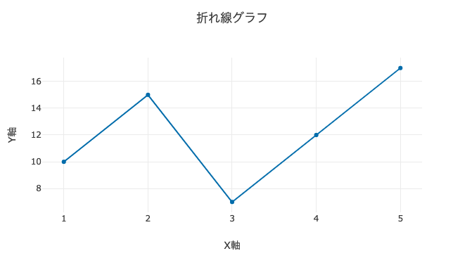
まず
<!DOCTYPE html>
<html lang="ja">

<head>
    <meta charset="UTF-8">
    <meta name="viewport" content="width=device-width, initial-scale=1.0">
    <title>Plotly</title>
    <script src="https://cdn.plot.ly/plotly-latest.min.js"></script>
</head>

<body>
    <div id="myPlot" style="width: 100%; max-width: 700px; height: 400px;"></div>

    <script>
        const trace1 = {
            x: [1, 2, 3, 4, 5],
            y: [10, 15, 7, 12, 17],
            type: 'scatter',
            mode: 'lines+markers',
            name: 'データ1'
        };

        const layout = {
            title: '折れ線グラフ',
            xaxis: { title: 'X軸' },
            yaxis: { title: 'Y軸' }
        };

        Plotly.newPlot('myPlot', [trace1], layout);
    </script>
</body>

</html>
基本ソースコード解説
①Plotly のライブラリを読み込む
Plotly の
<script src="https://cdn.plot.ly/plotly-latest.min.js"></script>※2026年10月2日追記:plotly-latest.min.js は、https://cdn.plot.ly/plotly-<バージョン>.min.js のようにtitle: '折れ線グラフ')がtitle: { text: '折れ線グラフ' } と
②グラフ描画エリアの作成
・グラフをdiv 要素を
・id="myPlot" グラフ描画の
・ style で
<div id="myPlot" style="width: 100%; max-width: 700px; height: 400px;"></div>③データ作成
const trace1 = {
    x: [1, 2, 3, 4, 5],
    y: [10, 15, 7, 12, 17],
    type: 'scatter',
    mode: 'lines+markers',
    name: 'データ1'
};x: X軸のデータ (1, 2, 3, 4, 5) y: Y軸のデータ (10, 15, 7, 12, 17) type: 'scatter': グラフの種類を 設定 mode: 'lines+markers': 描画方法を設定 name: 'データ1': 出力グラフのラベル
④レイアウトの設定
const layout = {
    title: '折れ線グラフ',
    xaxis: { title: 'X軸' },
    yaxis: { title: 'Y軸' }
};title: グラフのタイトル xaxis.title: X軸のラベル yaxis.title: Y軸のラベル
⑤グラフの描画
Plotly.newPlot('myPlot', [trace1], layout);Plotly.newPlot(id, データ, レイアウト)'myPlot': 描画するdivの ID[trace1]: グラフのデータ (複数設定可) layout: グラフの見た 目設定
Plotlyで描画可能なグラフの種類
Plotlyでは
いく
グラフ毎の
簡単な
よく使用されるグラフ
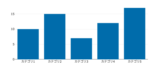
棒グラフ(Bar Chart)
const trace2 = {
    x: ['カテゴリ1', 'カテゴリ2', 'カテゴリ3', 'カテゴリ4', 'カテゴリ5'],
    y: [10, 15, 7, 12, 17],
    type: 'bar',
    name: '棒グラフデータ'
};
カテゴリごとの
カテゴリ間の
- 製品別の
売上や 数量の 比較 - 地域ごとの
人口や 学業成績の 比較
散布図(Scatter Plot)
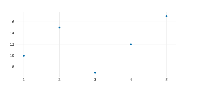
const trace3 = {
    x: [1, 2, 3, 4, 5],
    y: [10, 15, 7, 12, 17],
    mode: 'markers',
    type: 'scatter',
    name: '散布図データ'
};
2つの
- 収入と
支出、 身長と 体重などの 関係性 - 科学実験に
おける データポイントの 分布
円グラフ(Pie Chart)
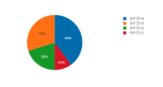
const trace4 = {
    labels: ['カテゴリ1', 'カテゴリ2', 'カテゴリ3', 'カテゴリ4'],
    values: [10, 20, 30, 40],
    type: 'pie',
    name: 'パイチャートデータ'
};
円グラフは
全体に
- 市場シェアや
投票結果の 割合 - 売上の
構成比や 予算配分
興味があるグラフ
ヒートマップ(Heatmap)
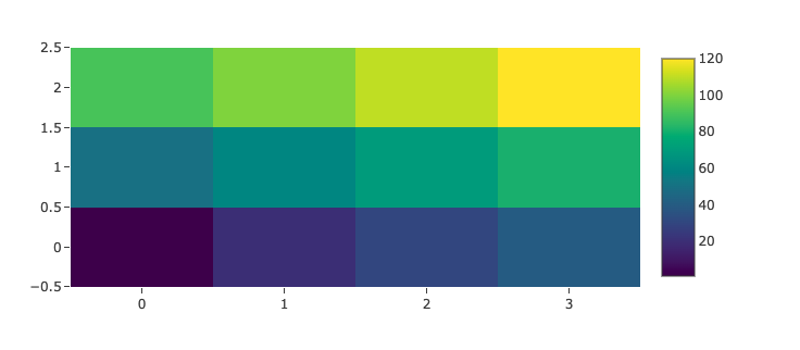
const trace5 = {
    z: [
        [1, 20, 30, 40],
        [50, 60, 70, 80],
        [90, 100, 110, 120]
    ],
    type: 'heatmap',
    colorscale: 'Viridis',
    name: 'ヒートマップデータ'
};ヒートマップは、色を
色が
- ウェブサイトの
「ヒートマップ解析」 :ユーザーが 最も よく クリックした 場所や スクロールした エリアを 可視化する。 - 地図で
「どの 地域が 一番 暑いか」を 示すとき。
レーダーチャート(Radar Chart)
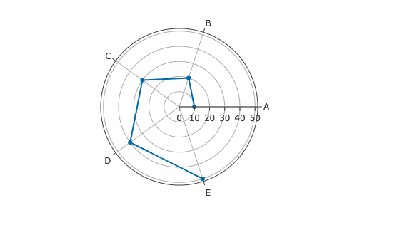
const trace6 = {
    r: [10, 20, 30, 40, 50],
    theta: ['A', 'B', 'C', 'D', 'E'],
    type: 'scatterpolar',
    mode: 'lines+markers',
    name: 'レーダーチャートデータ'
};
いく
筋トレに
- スポーツ選手を
スピードや 力などの 異なる 能力で 比較する とき。 - 製品の
特徴 (価格、 品質、 機能など)を 一度に 評価する とき。
3D系のグラフ
3D散布図(3D Scatter Plot)
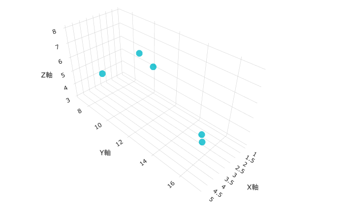
const trace7 = {
    x: [1, 2, 3, 4, 5],
    y: [10, 15, 7, 12, 17],
    z: [5, 3, 4, 8, 6],
    mode: 'markers',
    type: 'scatter3d',
    marker: {
        size: 8,
        color: 'rgb(23, 190, 207)',
        opacity: 0.8
    },
    name: '3D散布図データ'
};

const layout7 = {
    title: '3D散布図',
    scene: {
        xaxis: { title: 'X軸' },
        yaxis: { title: 'Y軸' },
        zaxis: { title: 'Z軸' }
    }
};

Plotly.newPlot('scatter3DChart', [trace7], layout7);3D散布図は、3つの
データポイントの
- 科学的データ
(例えば、 分子構造や 物理現象)を 視覚化する 場面など
3D表面グラフ(3D Surface Plot)
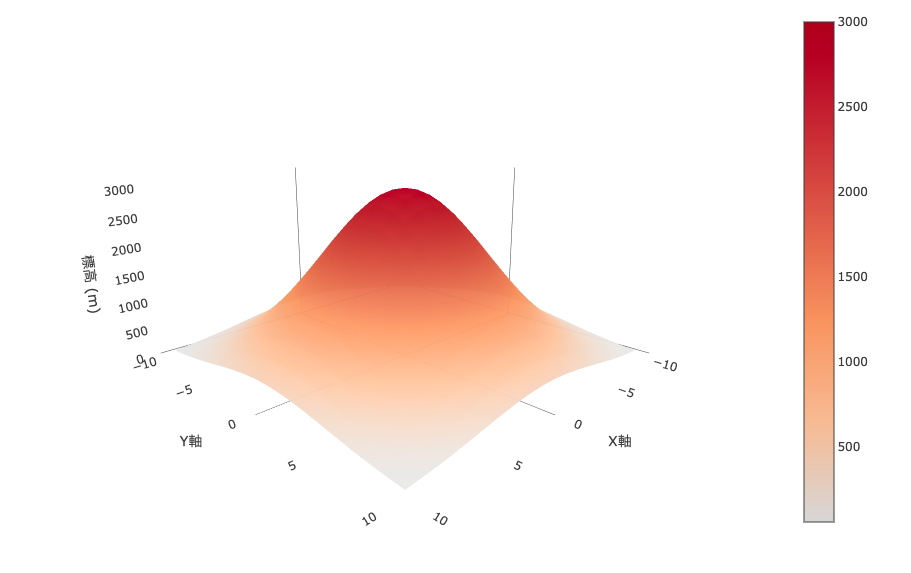
コードは
const trace8 = {
    x: x,
    y: y,
    z: z,
    type: 'surface',
    colorscale: 'YlOrBr',
    opacity: 0.95
};

const layout8 = {
    title: {
        text: '3D表面グラフ',
        font: { size: 24, color: '#333' }
    },
    scene: {
        xaxis: { title: 'X軸', showgrid: false, backgroundcolor: "rgba(0,0,0,0)" },
        yaxis: { title: 'Y軸', showgrid: false, backgroundcolor: "rgba(0,0,0,0)" },
        zaxis: { title: '標高 (m)', showgrid: false, backgroundcolor: "rgba(0,0,0,0)" },
        aspectratio: { x: 1, y: 1, z: 0.5 },
        camera: { eye: { x: 1.5, y: 1.5, z: 0.6 } },
        bgcolor: "rgba(0,0,0,0)"
    }
};3D表面グラフは、
X軸と
・aspectratio: グラフの
x: 1, y: 1, z: 0.5 は、
・camera: グラフの
eye: 視点のx: 1.5, y: 1.5, z: 0.6 は、
- 地形の
視覚化 (標高や 山岳地形の データなど)
業務で実装しているPlotlyグラフ
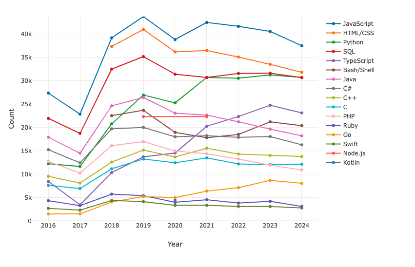
簡単な
Stack Overflowの
※年ごとに
【折れ線グラフ】
【箱ひげ図】
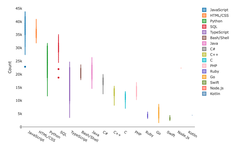
業務では
凡例に
ソースコードの
まとめ
今回は
今後業務で
Plotlyに
マーケティング面での
最終的には
株式会社bundlyzeでは、
よくある質問
C#でもPlotlyのグラフは使えますか?
使えます。
Plotly.jsで散布図を描くには?
データに type: 'scatter' と mode: 'markers' をmode: 'lines+markers' にtype: 'scatter3d' に
グラフの高さや凡例は変えられますか?
レイアウトでheight、showlegend、legend の x・y でmarker.color や line.color で